The Team page in Bud has a fresh new look! Discover everything about the new design and features.
In this post, we're doing something different and giving you a behind-the-scenes look at our latest update. Keep reading to learn more about how we created the new features coming to Bud!
Context
Since the first version of Bud, our team had been discussing ways to enhance the Team Page experience. Until then, it was simply a list of objectives that could be expanded to reveal their key results. It was a straightforward and somewhat limited screen, but it served its purpose for a product that was just starting out.
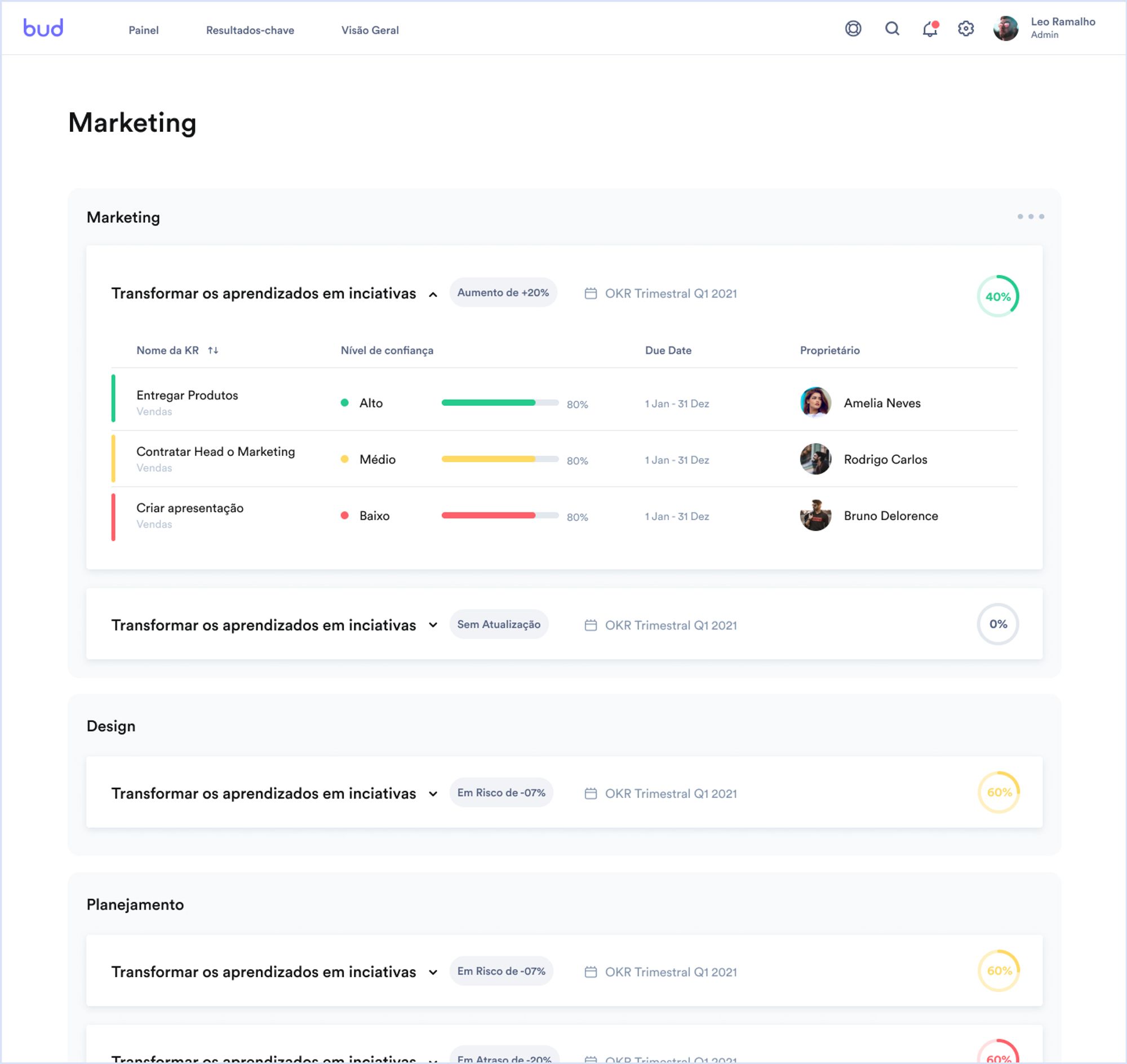
Perhaps more importantly, the Team Page had a hierarchy problem. Only the major areas of companies had a dedicated page, such as Marketing or HR, for example, and any "sub-teams" within these structures shared the same space, displayed one below the other, separated by sections. In the image below, from the original Bud Team Page, you can see how this worked:

There's no visual indication of hierarchy between these teams. In the example above, "Marketing" is an area, department, or division (each company calls it something different), and "Design" and "Planning" are teams that fall under Marketing in the company's organizational chart. This hierarchical relationship wasn't clear, and it would become even more confusing if we tried to include more levels in this structure, such as a sub-team of Design, for example.
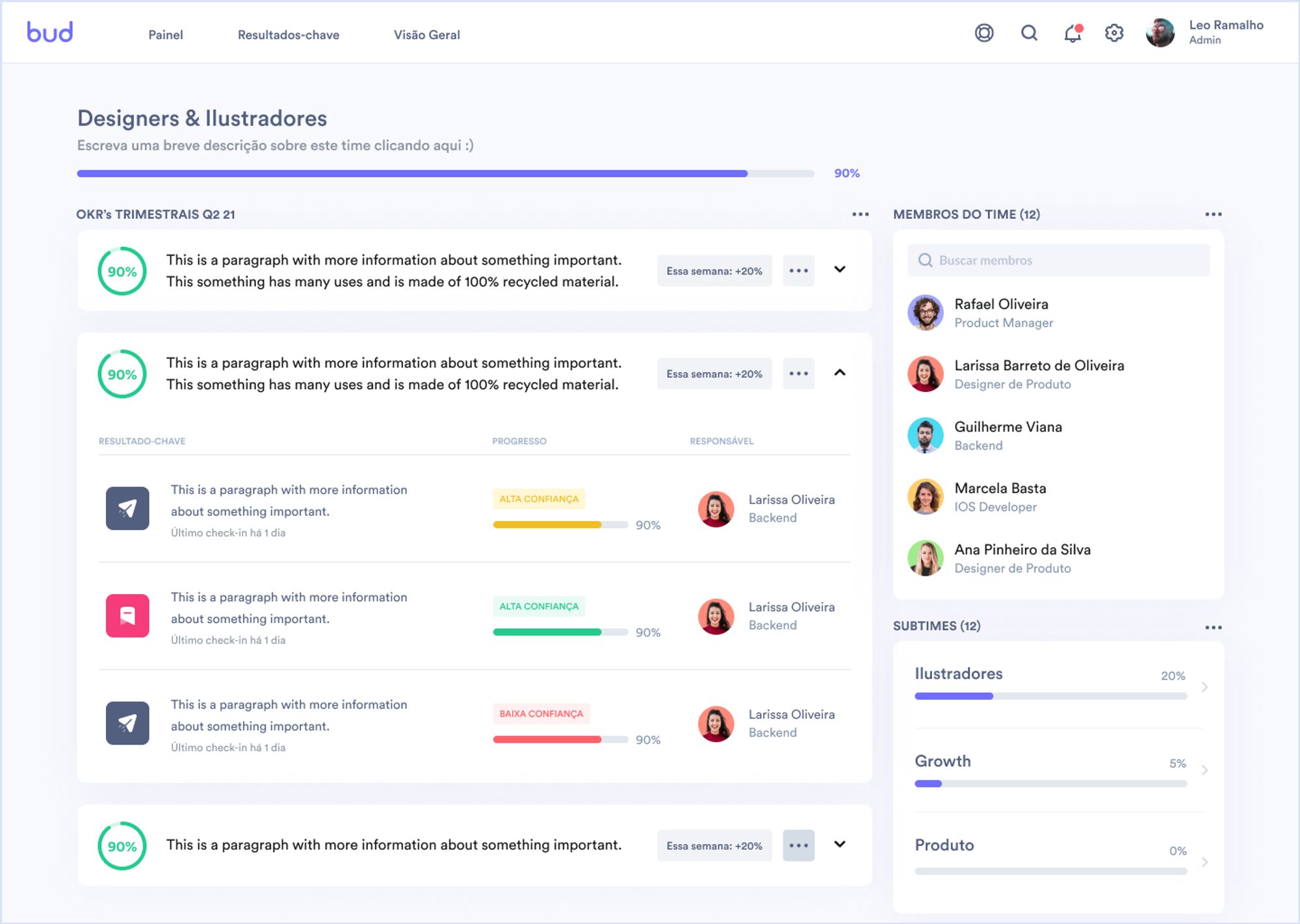
To make Bud more scalable and functional for larger companies, we needed to rethink the Team Page experience. After weeks of research, sketches, and user testing, we arrived at a solution that consists of a new two-column layout where we can display, in addition to OKRs, additional information such as sub-teams. This new organizational paradigm allows us to create a kind of "infinite navigation" where users can access a team and, through it, "go down" level by level through its sub-teams until they reach any structure in the company. Each team now has its own page, and exploring the OKRs at each level becomes clearer and more intuitive.

In addition to allowing Bud to work better in companies with more complex structures, the new Team Page also brings a significant visual redesign. This is the first place in the platform where we've applied the new visual identity created by our designers, based on white cards with rounded corners "floating" on a light gray background, with the application of a subtle shadow to increase the contrast between elements. Our intention with this design is to maintain the clean and minimalist spirit of the platform while creating opportunities to increase the density and complexity of the information displayed on the screen. We plan to bring this design to other areas of the platform soon!
In addition to the new look and navigation logic, the new Team Page also introduces a range of new features aimed at making Bud even more useful, practical, and user-friendly:
The new Team Page also includes:
✅ The description of each team, when present;
✅ A progress bar for that team, considering the average of its current objectives;
✅ The ability to create and delete key results without needing to contact our support team;
✅ The ability to delete objectives;
✅ The complete list of members of that team;
✅ The list of sub-teams below that one in the structure (and their current progress)
____________________
So, what do you think of the new feature? 😊
We work hard to make Bud better and are always attentive to feedback from our user community. If you'd like to share your comments and suggestions about Bud or if you need assistance from our support team, please reach out to us by sending an email to help@getbud.co.
Until next time, and best of luck with your OKRs!
Bud Team
© Bud, 2023. Todos os direitos reservados.


